
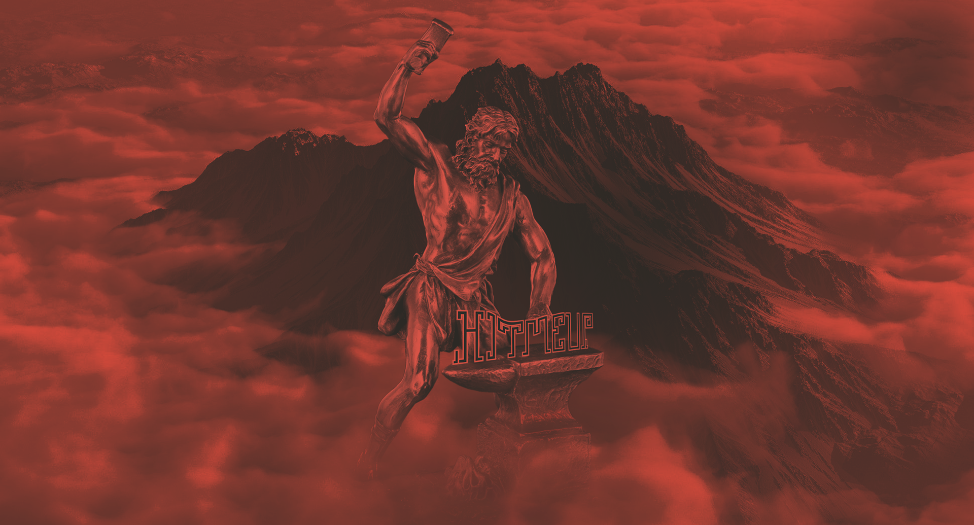
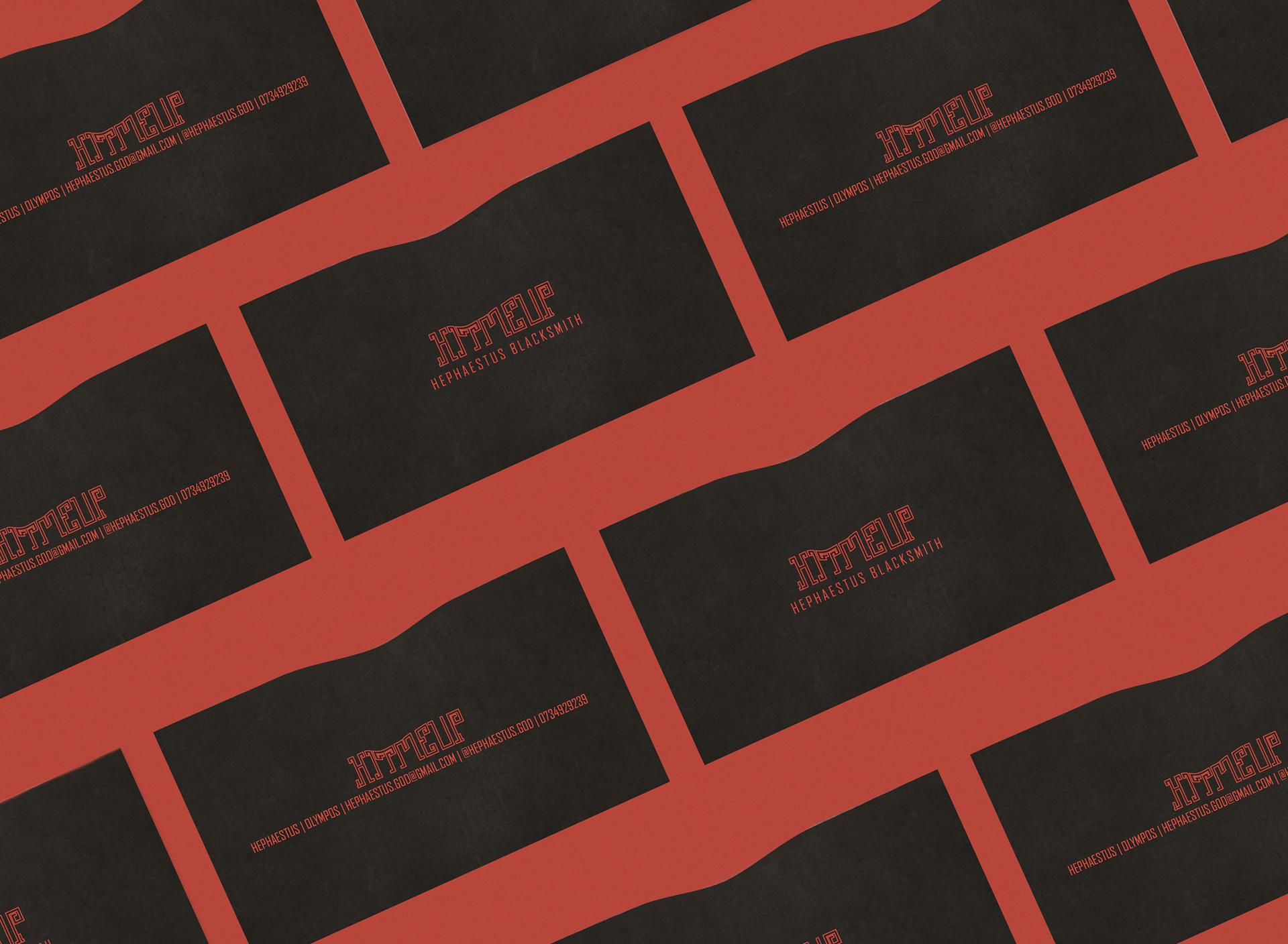
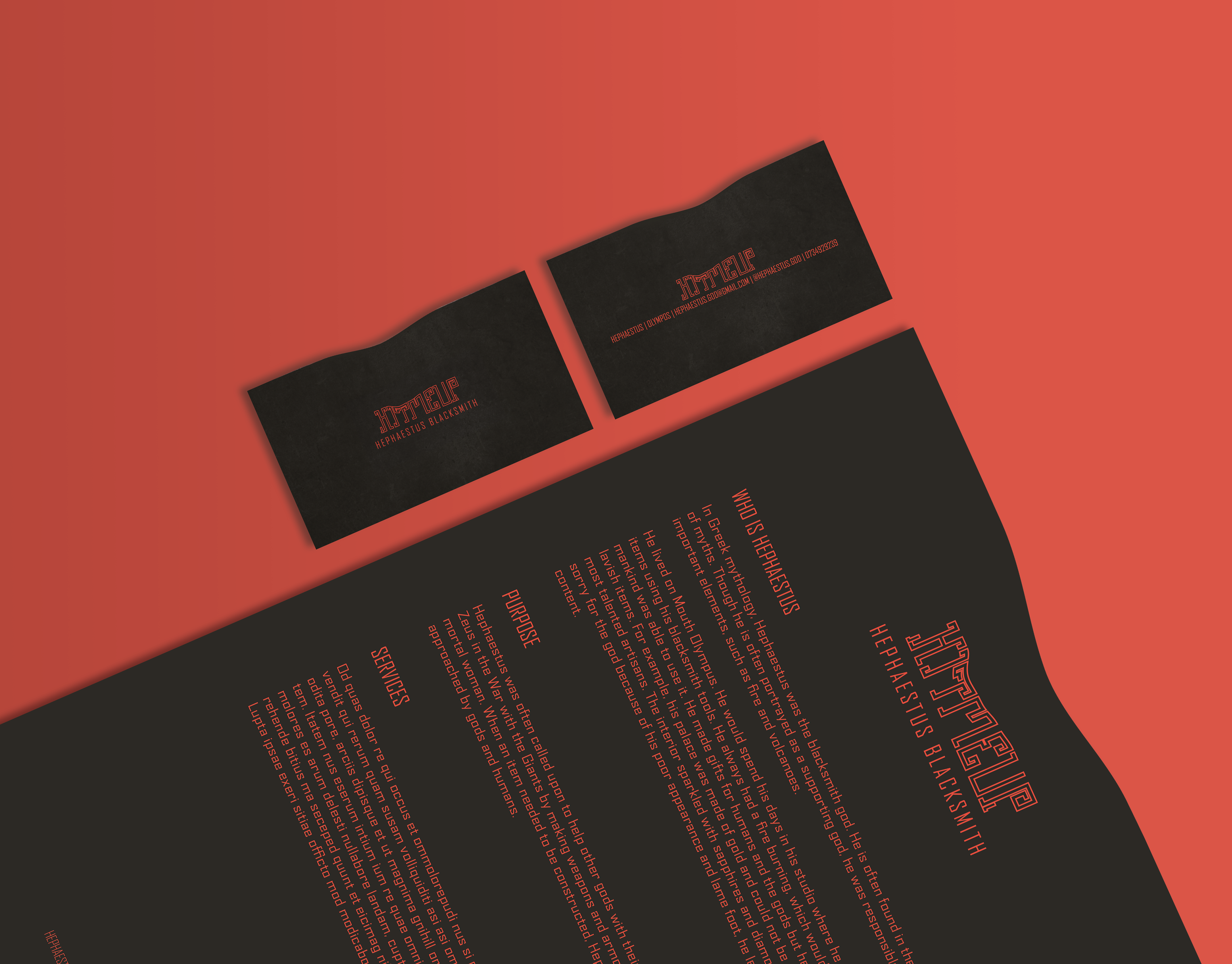
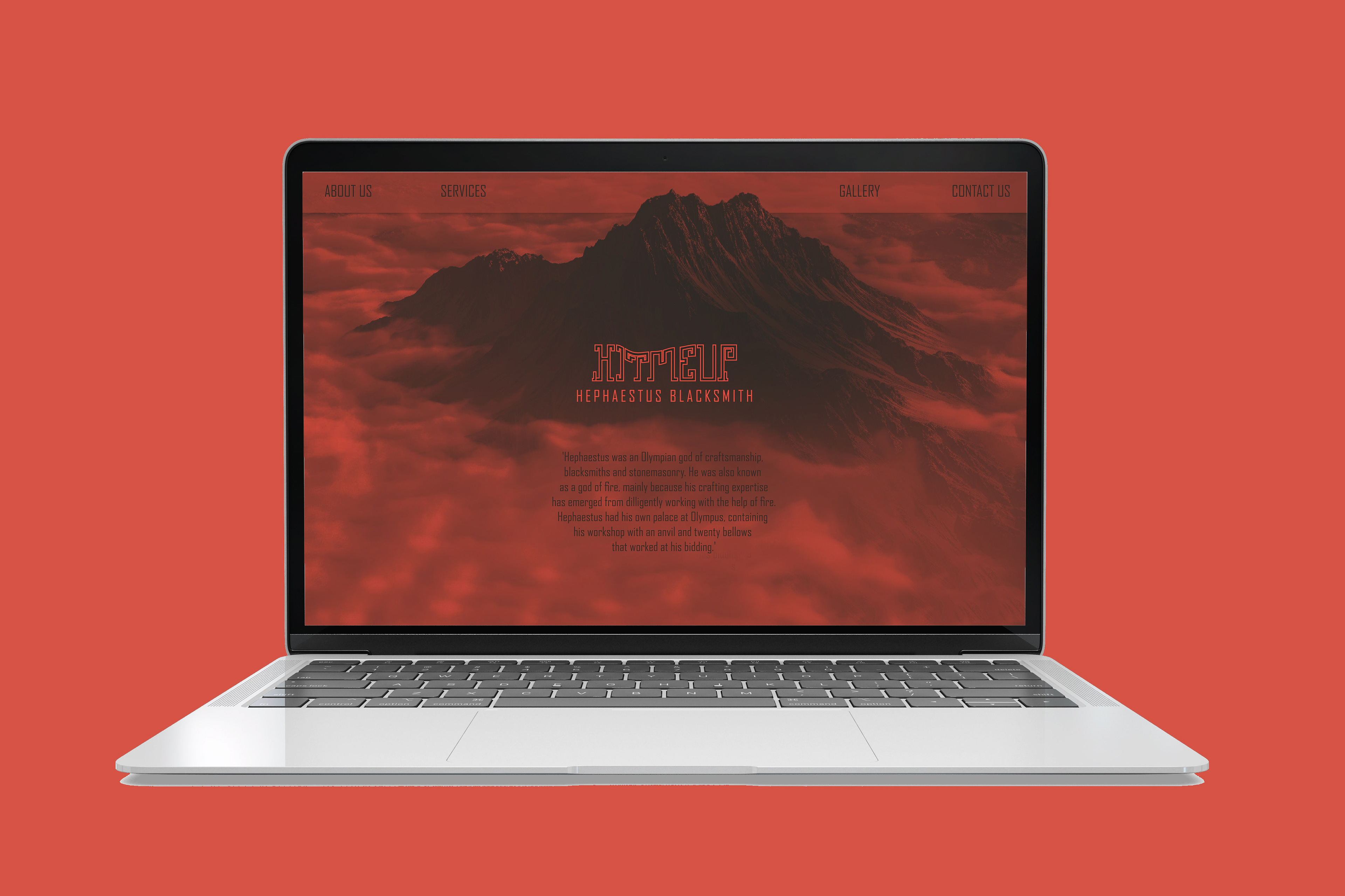
The challenge was to create a branding for a blacksmith. Through my research I discovered that in Greek mythology the god of blacksmithing was ‘HEPHASTUS’. I decided to base the whole branding on the Greek god thus the typeface and the colors are inspired by the ancient Greek art. Moreover as a name of the company I used the phrase “HIT ME UP” that is a play word related to the specific profession. In addition the logo has a shape that seems distorted after being hit by a hammer. In order to keep this effect into the whole branding the business card and the letterhead are catted with a curve.